Overview
Background
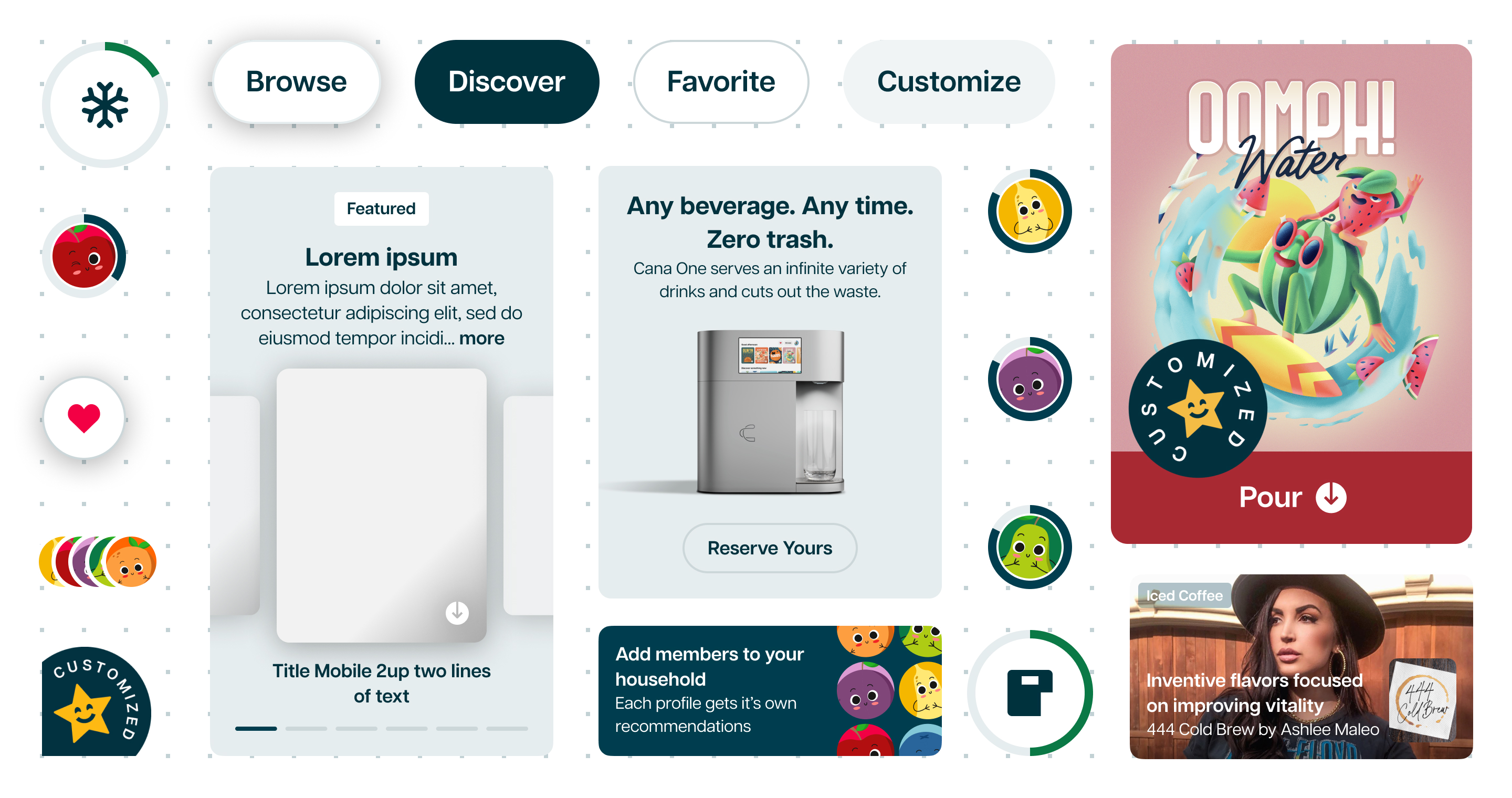
Cana was on an audacious mission to create the world’s first molecular beverage printer, able to print any beverage from molecularized ingredients from a cartridge mixed with water, sugar or alternative sweeteners, and alcohol or carbonation.
This beverage printer was designed to democratize small scale manufacturing of beverages, providing infinite choice and unlimited consumption with less waste as reducing plastic, cans, and CO2 was part of our mission.
Problem
The product team developed solutions across different touchpoints, and each of software platforms had different versions of each component implemented quickly.
Opportunity
We can partner with our Engineering team to provide design tokens, consistent components and ensure that sizing, color, and component implementation is consistent across platforms.
Solution
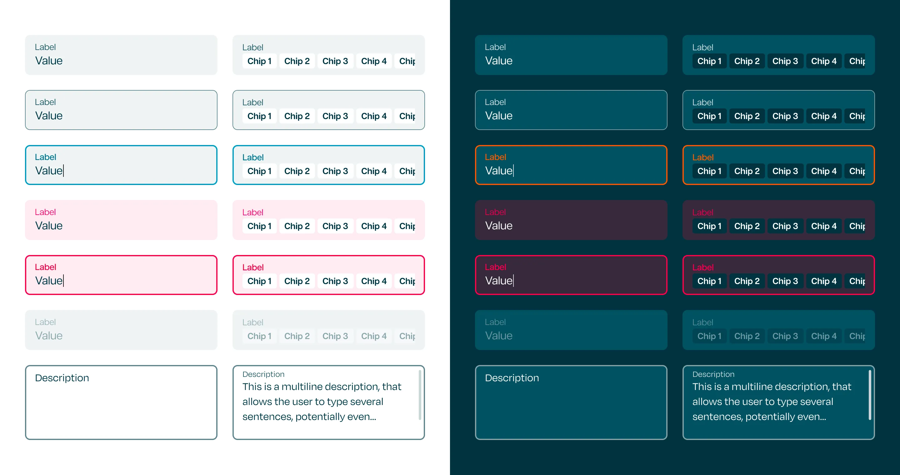
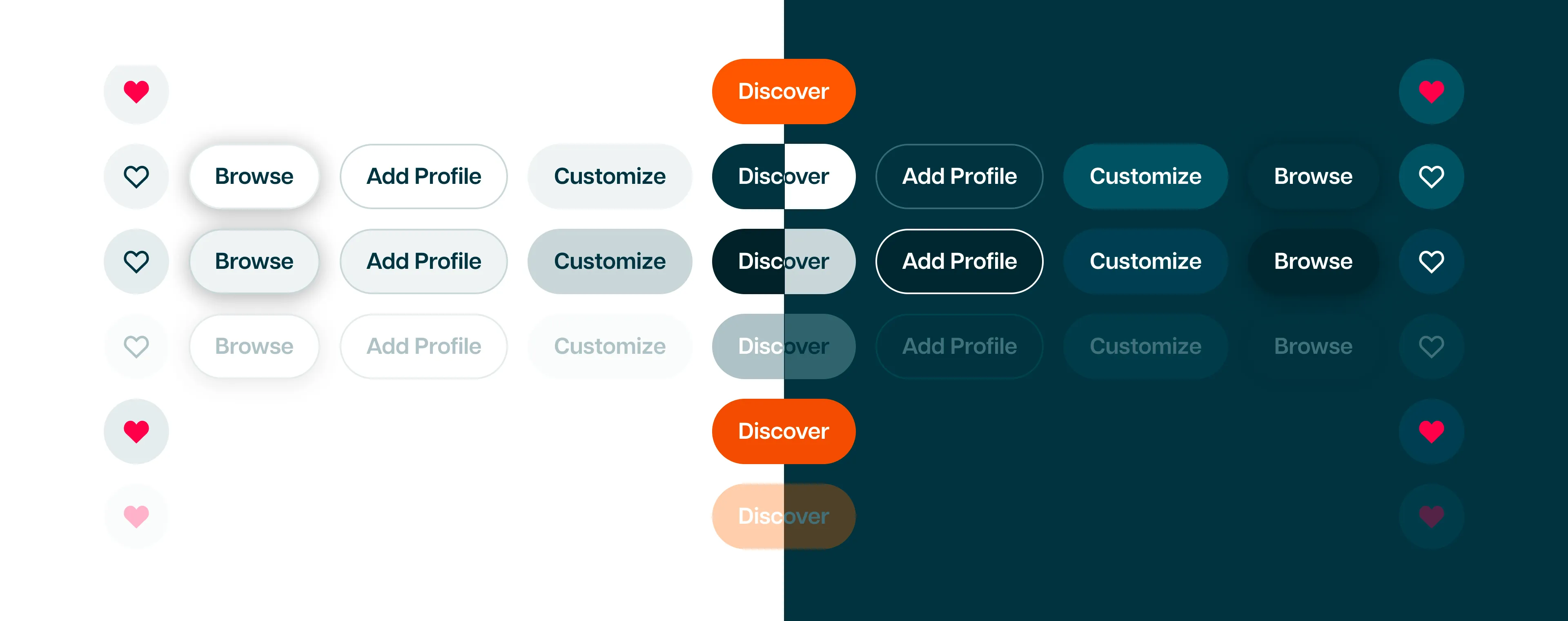
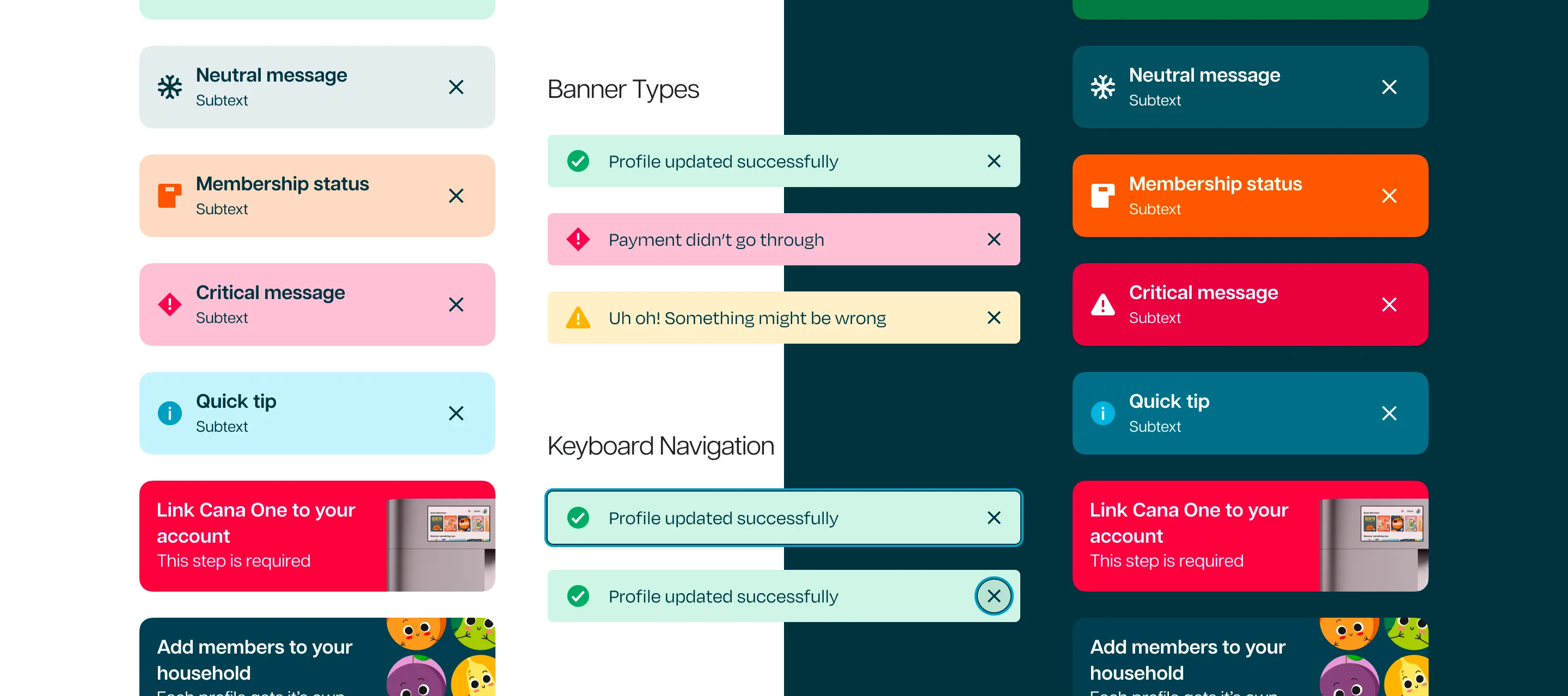
I delivered detailed guidelines on component states, building specs, and usage requirements for implementation on Cana One, iPhone, iPad Pro, Surface Studio, and Web on a variety of sizes.
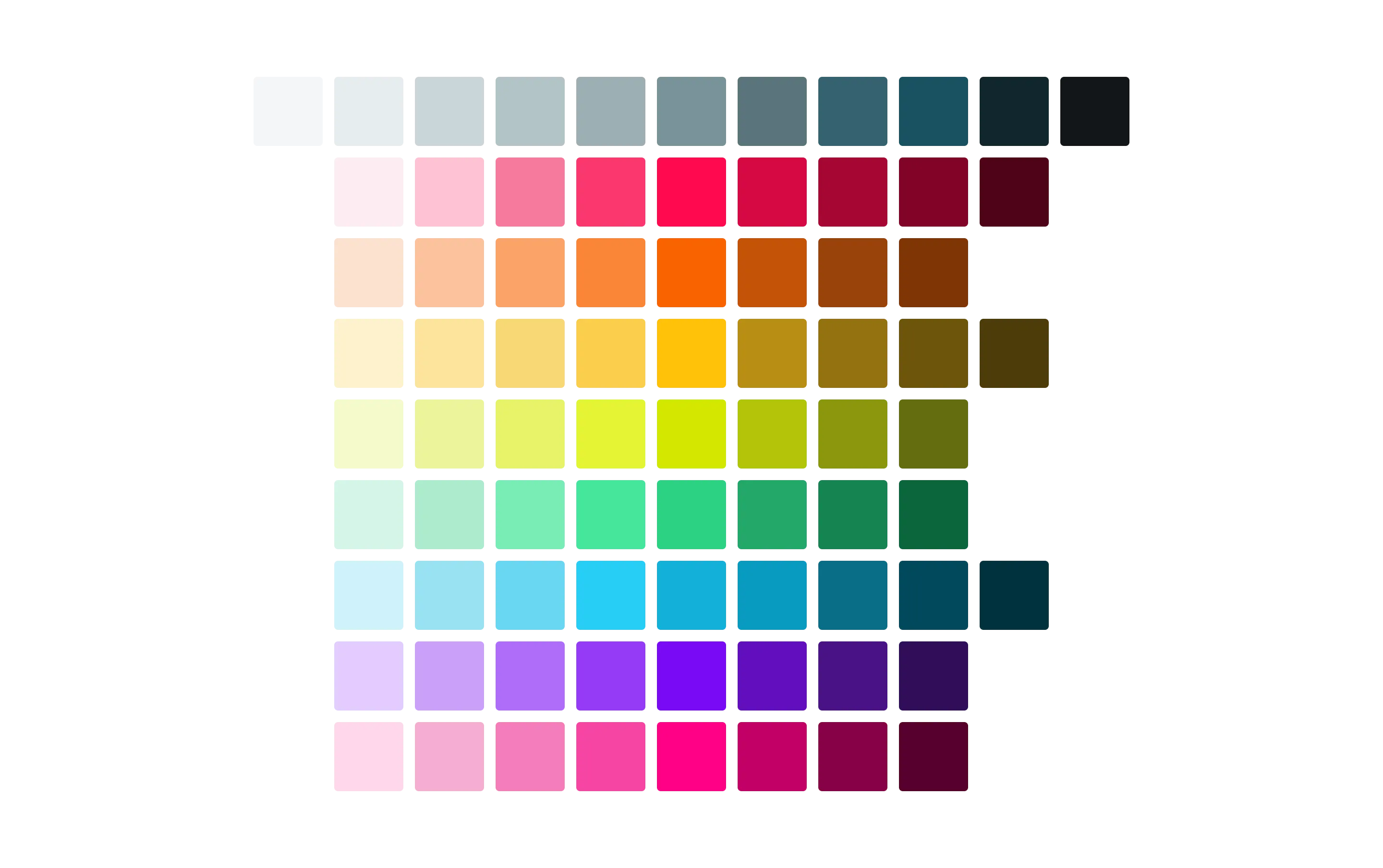
I updated our color palette and components to adhere to WCAG 2.1 accessibility standards through color contrast, correct component usage for screen readers, and standardized patterns to be consistent in multimodal customer experiences.
Impact
These guidelines helped the developers understand all aspects of the behavior and implementation that could not be communicated through prototypes.
We saw a massive reduction in the quantity and severity of visual and interaction bugs after documenting and presenting guidelines based on each project.
Role
I lead system design for Web and Creator Studio, and collaborated with our Head of Design on device and mobile system design work.
Team
I collaborated with our engineers in organizing our design components in a file, including all states and variations needed for each version, and documented how to interpret components that required more detailed explanation.
![]()