Overview

Background

Cart.com had merged multiple products together through acquisitions and offered an alternative for brands to have a comparable customer experience to Amazon through offering online store, fulfillment, analytics, inventory management, multi-channel sales management, and more.
These products were existing web tools that needed to be integrated across various systems, and since they were not built responsively we had gathered feedback from sellers that they wanted a way to easily access their business on-the-go and not always behind a desktop or laptop computer.

Existing Cart.com User Interface across products

Problem

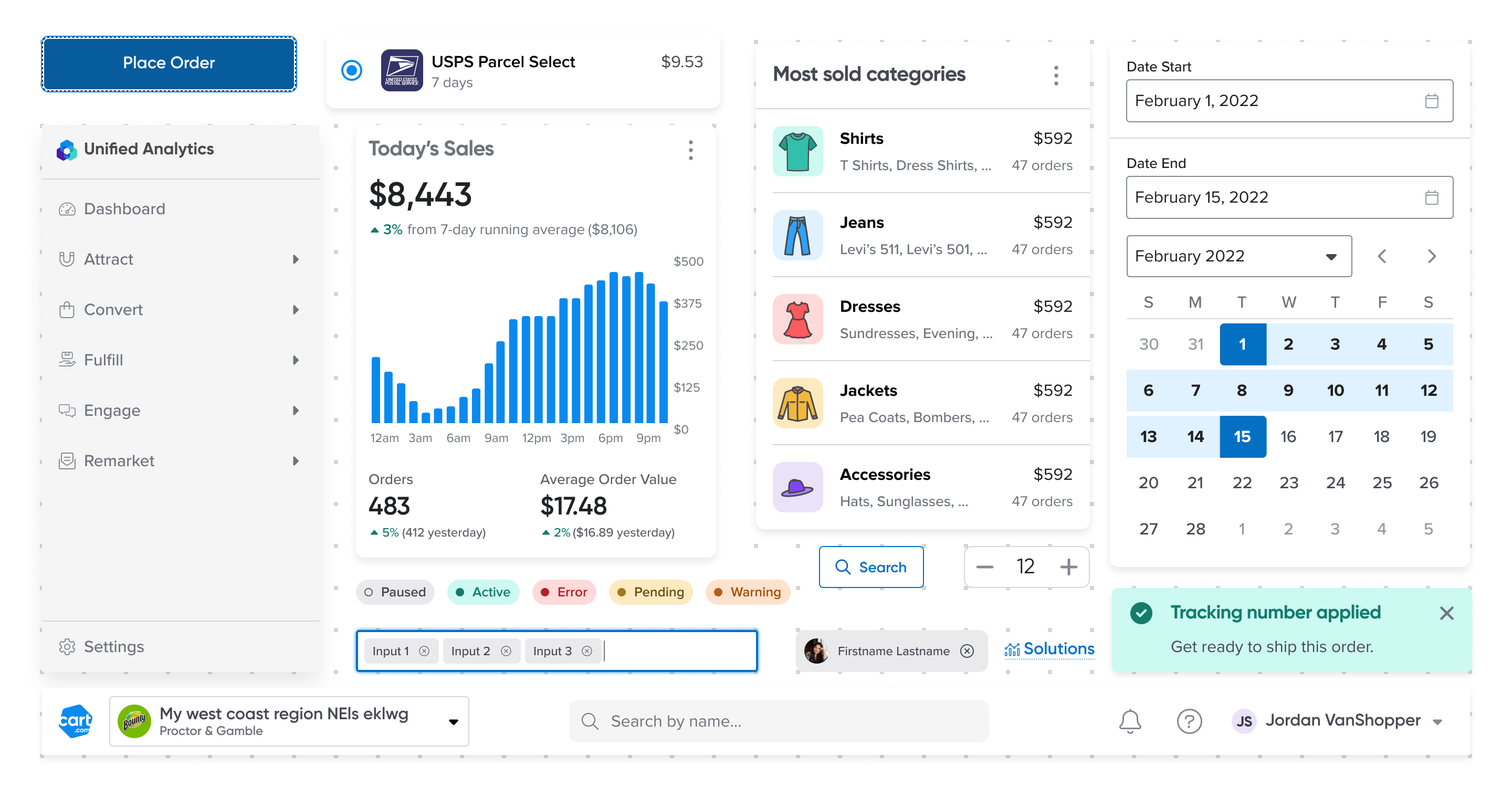
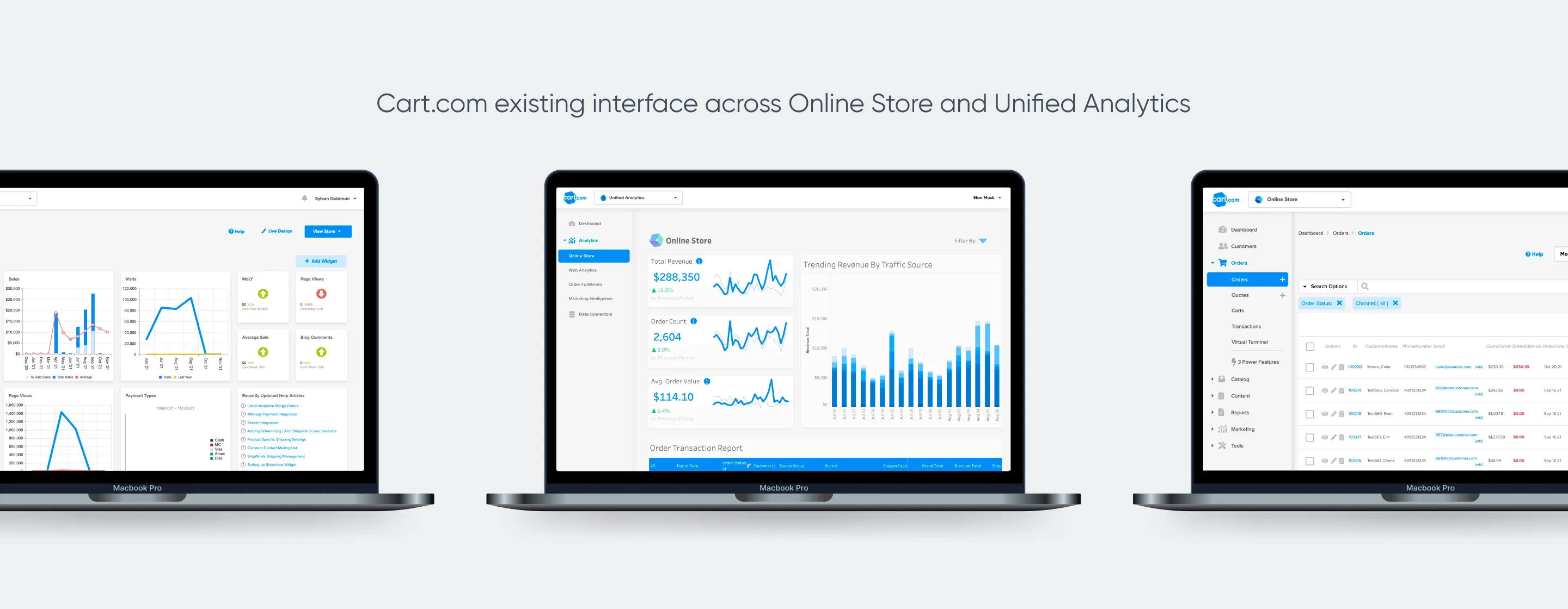
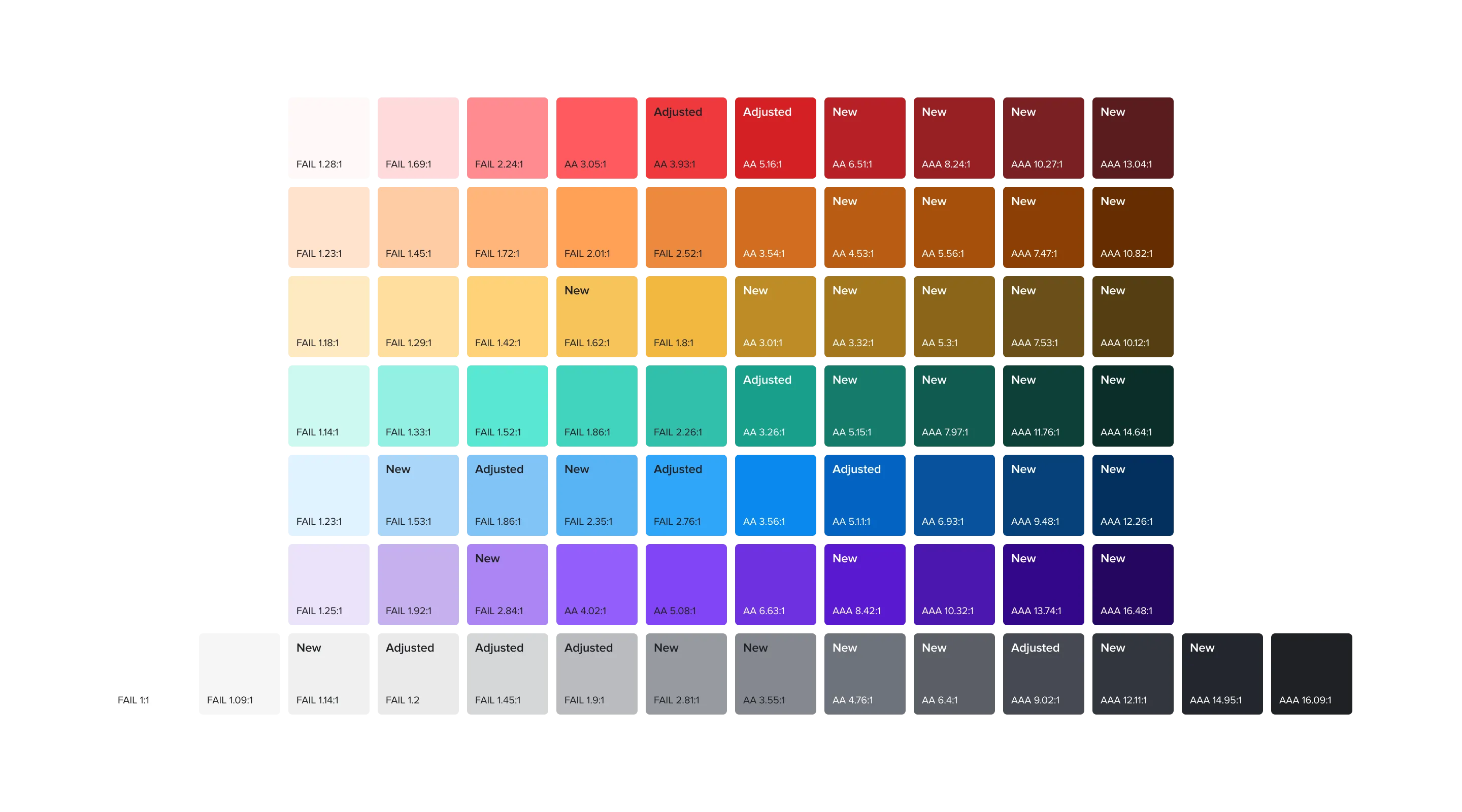
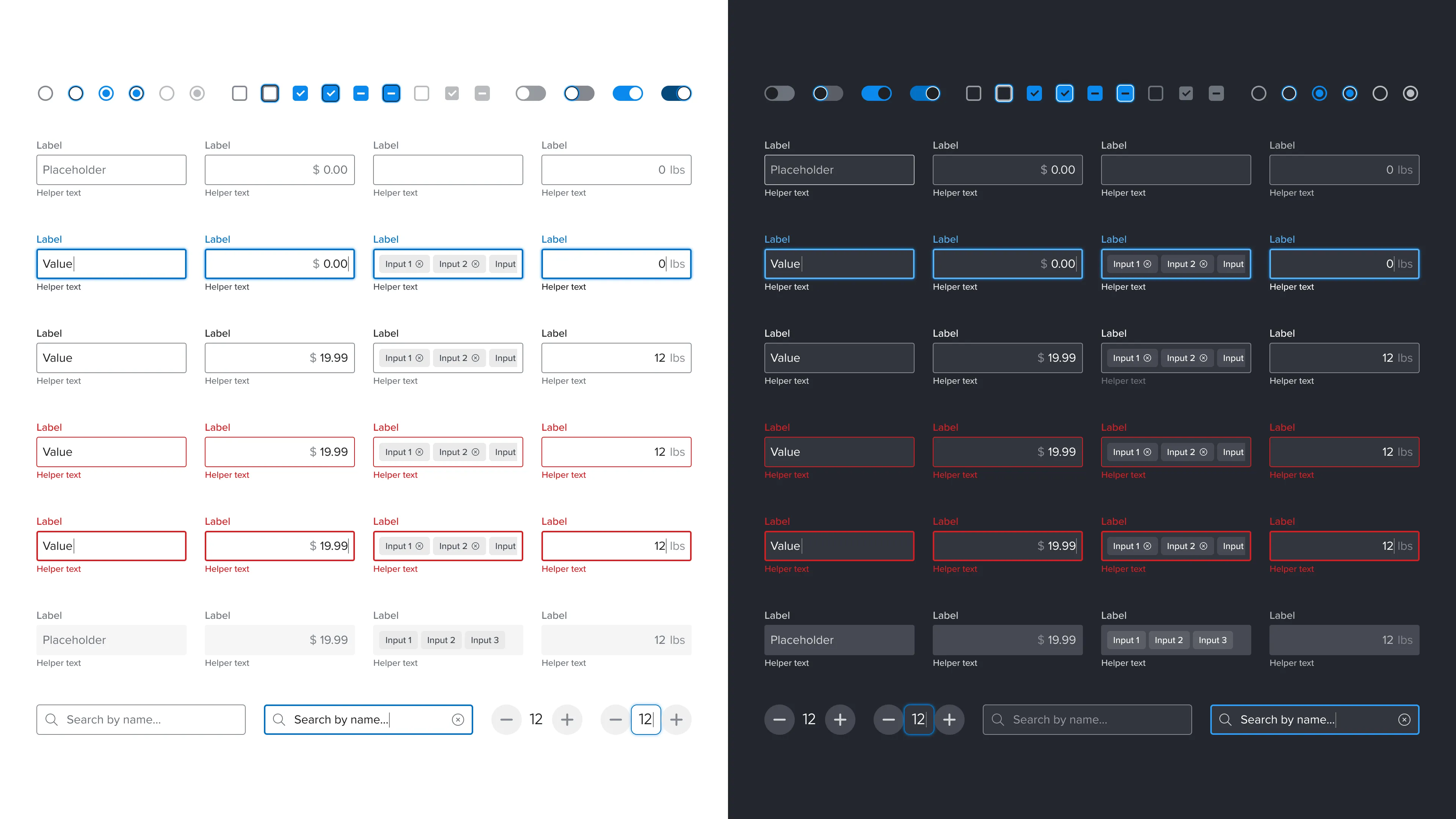
The existing design system utilized components and type sizing that was often too small and not usable for touch devices, and colors and components did not meet WCAG 2.1 accessibility standards.

Opportunity

Adapting existing products and features for a native mobile experience presented an opportunity to review existing components and their usage within the product and how we could improve the components to have sufficient color contrast and keyboard navigation, as well as make them more usable in terms of standardized typographic hierarchy, larger tap targets, and differentiating visual states effectively.

Cart.com updated color palette for better accessibility support

Cart.com color palette with new and adjusted color swatches to support enough color contrast for accessibility and shading for light and dark modes.

Solution

I adapted Cart’s brand colors to include additional steps of higher contrast for both dark and light mode and color combinations for accessibility.
I started this and used the mobile platform to redesign components that could be improved in terms of visual consistency, usable interaction patterns, and consistent component usage.

Checkboxes, Radio Buttons, Switches, Text Input fields, Increment fields and search bar redesigned for Cart Design System

Form and Input fields adjusted to pass WCAG A11Y standards with larger text, higher color contrast, and clear definition of focus states.

Report Cards designed for mobile Cart Design System

Redesigned reports in card motif to encapsulate high level key metric, comparison metrics, and visualized interpretation of data to quickly communicate the story behind the data.

Role

I lead a weekly meeting to review how we were using existing Cart brand components in each product, determine if these components were consistent, usable, and accessible, and to determine broader patterns of component and pattern usage across products in order to create a consistent ecosystem.

Team

I lead the weekly Design System meeting discussing Cart components and implementation with 3 Senior and 1 Junior Product Designers and 1 Front-End Engineering lead that was coordinating common component implementation of our token, variable, and component decisions.