
Overview
Background
User
Existing on-the-go owners of e-commerce businesses was our primary audience for the Cart Merchant Mobile app, and we determined these users priority needs were to understand daily revenue, orders, and visitors, be able to easily view and update orders, and be alerted when things were going wrong so they could easily fix the problem.
Problem
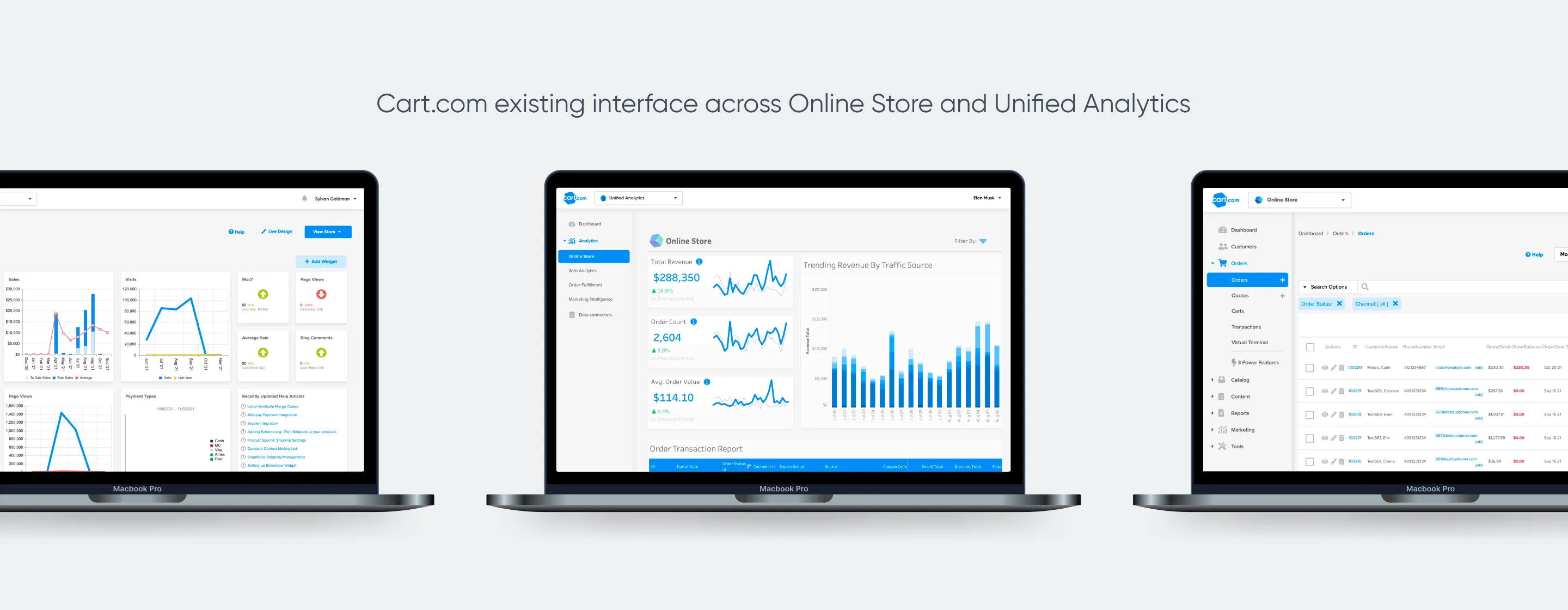
Cart’s current experience is not mobile-optimized and is not usable. Web applications prevent the user from feeling integrated with their business and taking advantage of location services, camera access, Face ID, and other native mobile features.
Solution
Role
I lead product design to define the scope, user experience, visual design, and information architecture of the mobile app.
Team
I collaborated with Head of Product and Product Manager on the product definition and gathered feedback from designers that lead other products as to the current state of experience and what informed the decision process. I reviewing mobile flows with my PM and Head of Product, as well as designers and engineering managers from web products to ensure that the interaction design and feature decisions matched their experience with how customers used our product and what was technically feasible.
Process
User Personas
I conducted stakeholder interviews with members of the team to understand Cart.com’s various user types and distilled them into these proto-personas to be able to ensure the features we focused on for the mobile app were aligned to practical use-cases for the proto-persona Evan.

Affinity Diagramming
I lead a workshop with the Head of Product and Product Manager to define the primary tasks and information that businesses would find critical using on the go in a mobile app. We defined Reports, Orders, Inventory Management, and Notifications all to be the main critical areas.

Order States Workshop
I lead a cross-functional workshop with stakeholders from the Order Fulfillment and Online Store teams to update the Order States and Names and separate out the Order States from the Payment states.

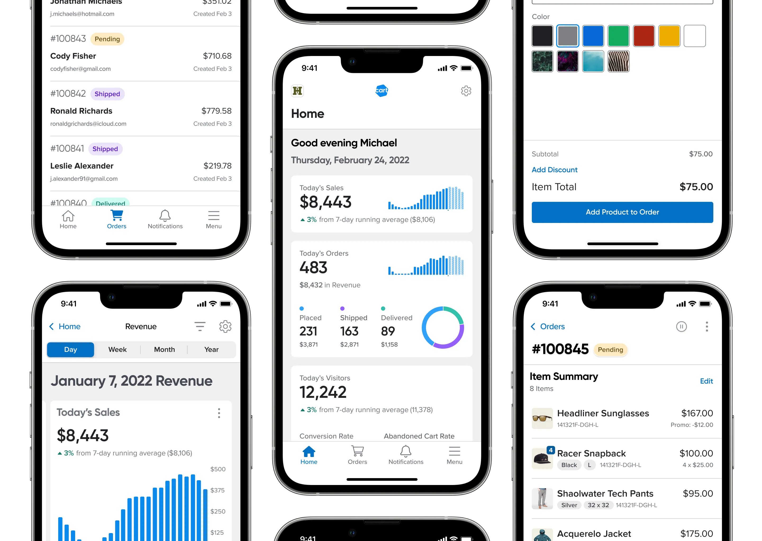
Structuring Reports
I structured the report page with the time-comparison representation at the top. As the user scrolls down, they see a carousel of category comparison cards, a set of actionable insights derived from metric analysis, and a set of related reports to the current report.
