Overview

Background

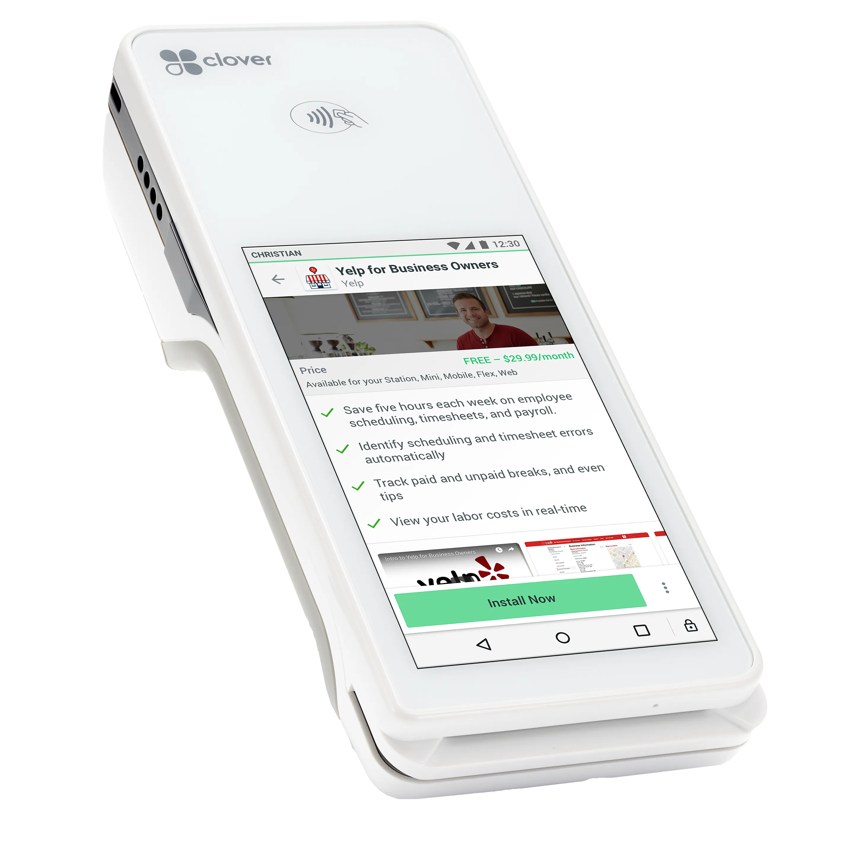
Clover provides a point-of-sale ecosystem for small and medium-sized businesses, that includes hardware to ring up orders and take payments on, software that adjusts to their business need and allows the merchant to track reporting and sales on their phone or web browser, and offers an App Market where merchants can find tools that better fit their specific business needs.
Merchants use the App Market to extend the capabilities that Clover provides with apps built to help them with taxes, Full Service Restaurant table management, connecting their Clover data to Quickboos and other services, Yelp My Business management, and more.

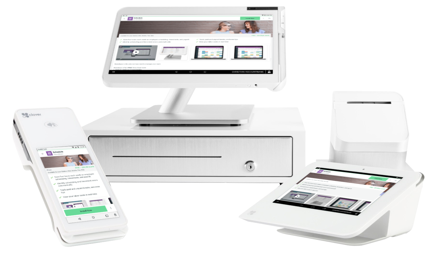
Clover Devices including Station, Mini, Flex, and Go cutoff midway to bottom of devices

Business Goal

Increase engagement and install of apps. Merchants that utilize apps from our app market tend to be more successful and recommend Clover more highly (increased NPS).

Problem

Merchants can’t easily assess how an app will benefit their business because the information is confusing, scattered, and hard to compare with similar apps.
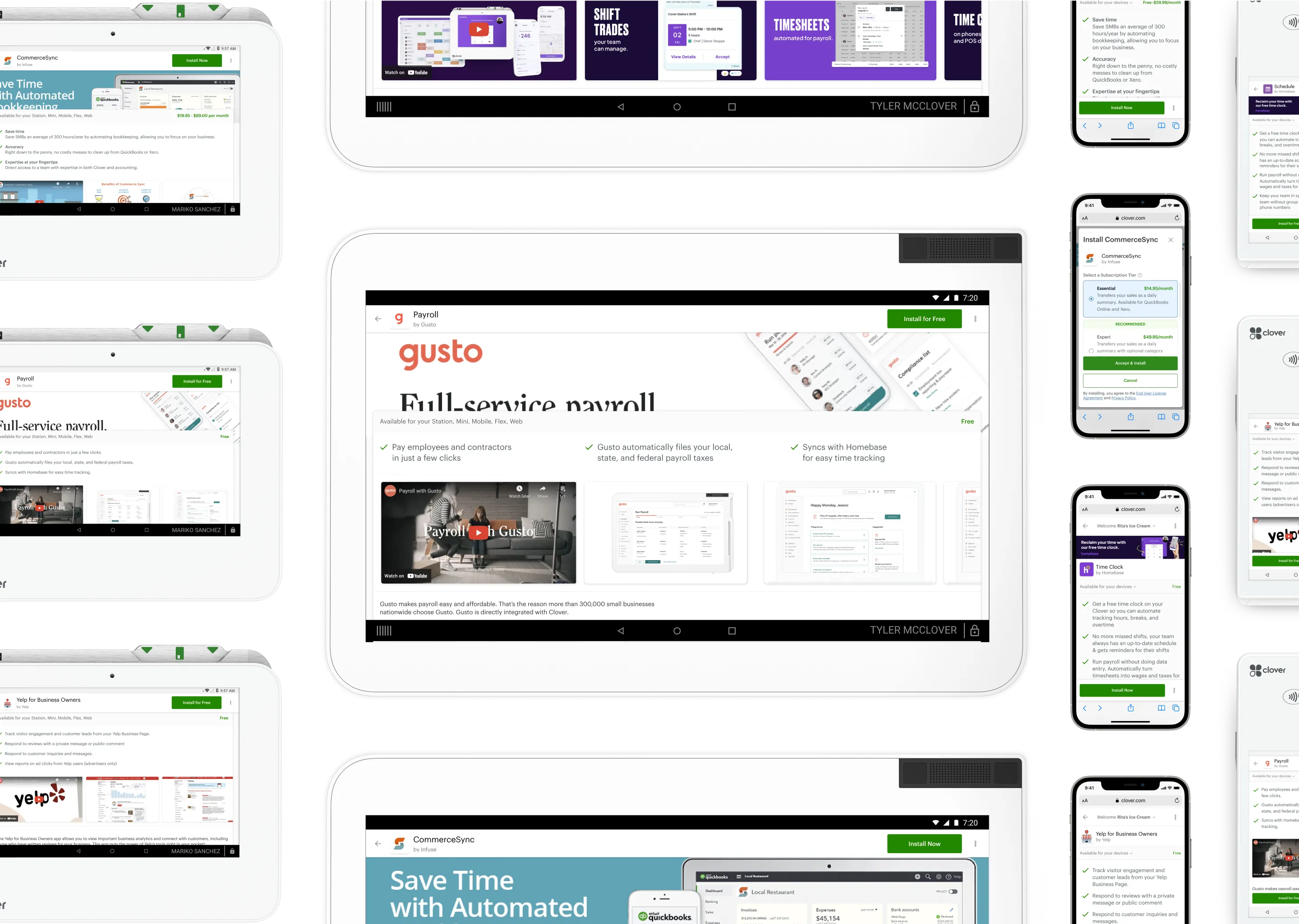
Grid of Clover devices with App Market Detail screens displayed

Solution

The redesigned App Market detail page highlighted key benefits to the merchant, collapsed media together to be easy navigate across devices, and provided an always present primary call-to-action as well as secondary CTAs that could be tracked and fed back into a follow-up re-engagement campaign.
The App Market redesign covered logged in and visitor use cases on web and across mobile and tablet-sized Clover devices. The App Market redesign also summarized price ranges for apps and clarified the

Impact

We rolled out the feature through A/B testing on specific apps and saw a huge increase in engagement and installs for these apps.
Our A/B testing resulted in 5.6% increase in conversion and 13.8% increase in engagement compared to the original app detail view.

Role

I was the sole product designer defining the scope, iterating on designs, and collaborating with engineering on execution.

Team

I worked with a Product Manager and several front-end web and Android engineers to deliver this feature.


Process

Heuristic Evaluation

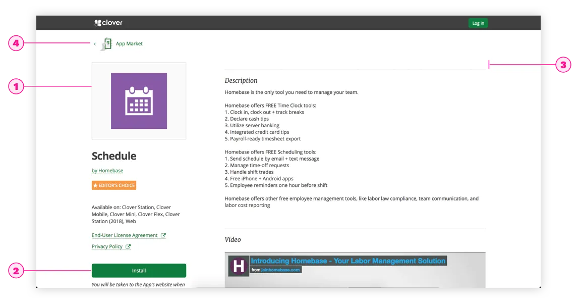
I reviewed the existing app detail page and noticed that the old app icon takes up too much space, Install is at the bottom of the screen or below the fold, the media is much lower on the page then it should be where its the most engaging way for people to see what the app does, and the structure of the page isn’t laid out well for either mobile or desktop.
Old App Detail Heuristic Evaluation

Wireframe Iterations

I iterated on various layouts of the app detail page, exploring variations in layout of pricing information, ratings, benefits, carousel of media and other details. I settled on a final solution taking some elements from all, of these explorations, for different screens.

Developer Dashboard New Information Architecture