Beverage Search & Discovery
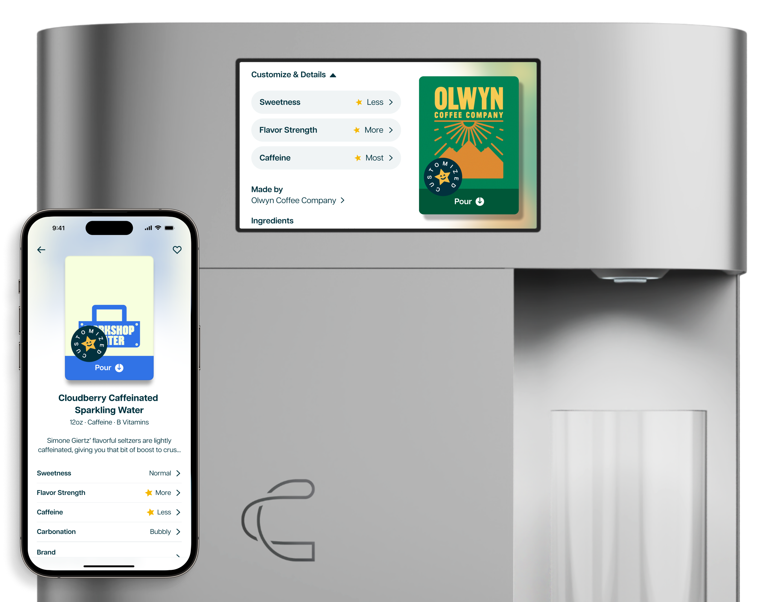
We designed search and updated browse by improving information architecture, beverage categorization, and displaying relevant beverage attributes.
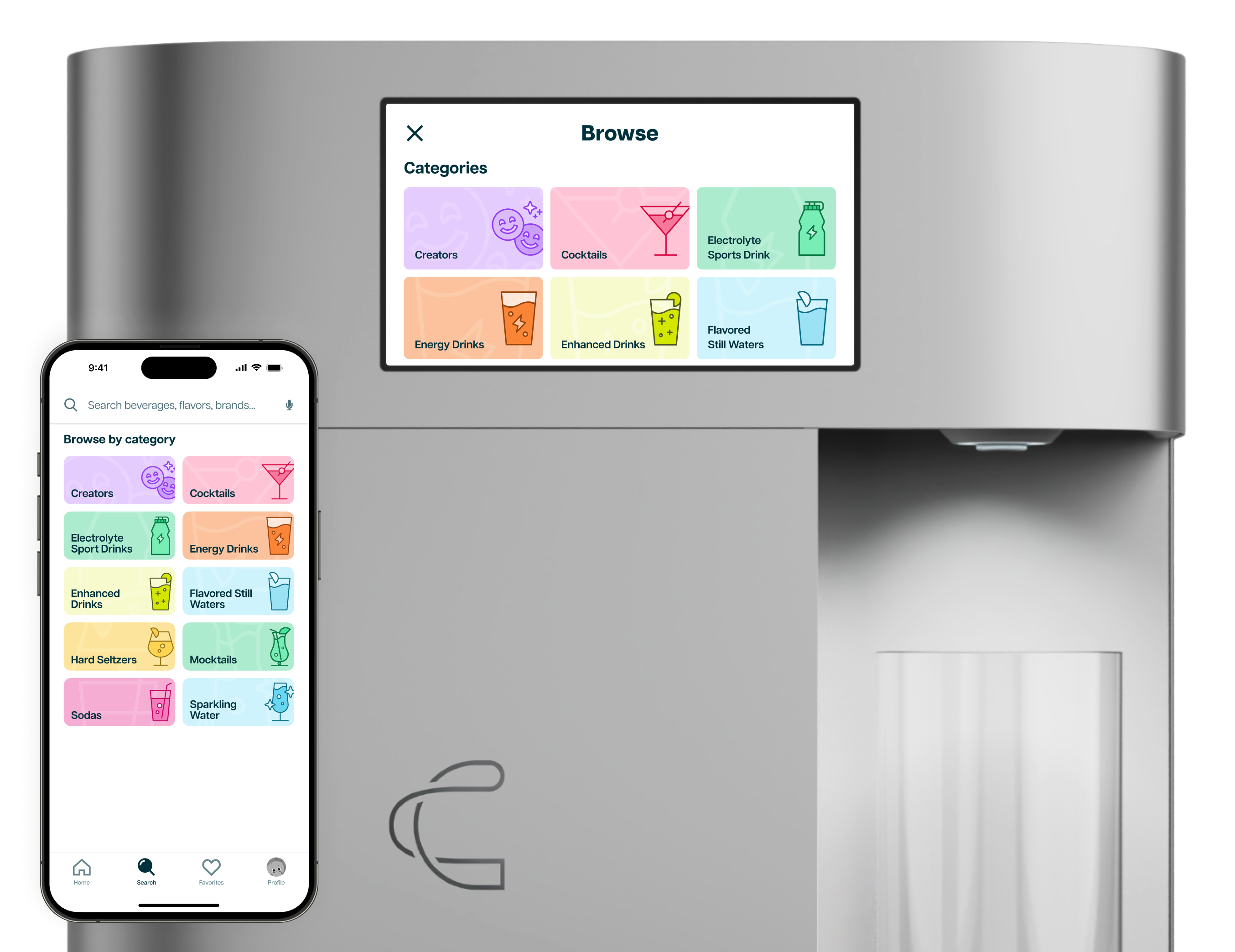
We designed search and updated browse by improving information architecture, beverage categorization, and displaying relevant beverage attributes.

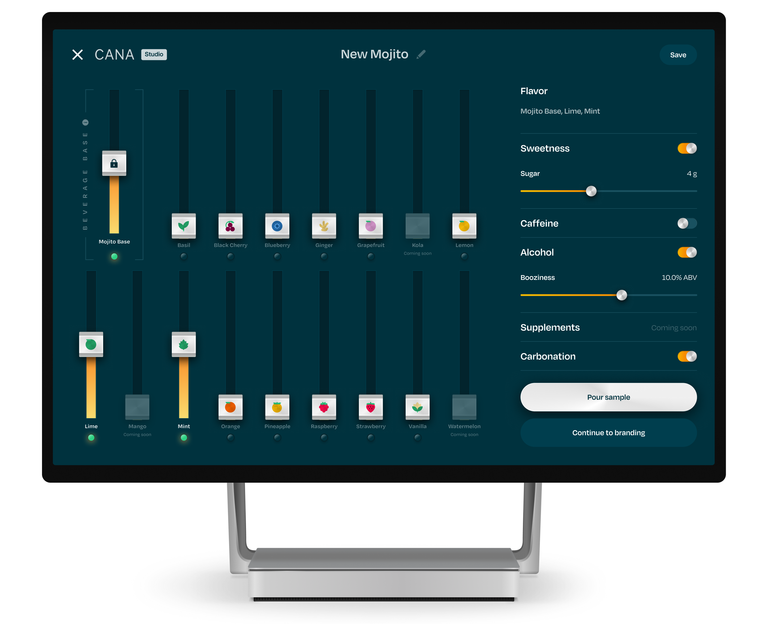
A beverage studio to help partners create beverages from building blocks and brand and publish their beverage in 5 minutes.
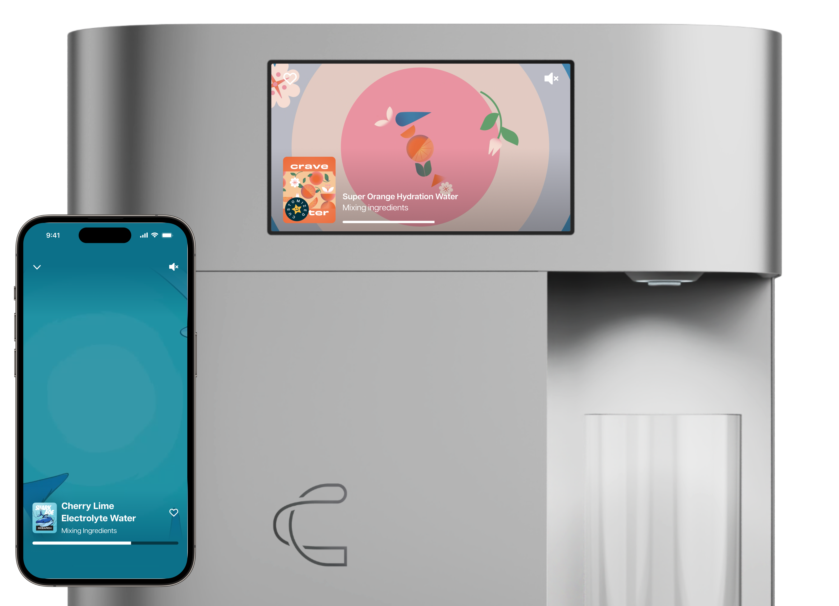
We created a structured pour experience that allowed beverage brands to demonstrate their identity and build customer's anticipation for their beverage.
We created a customization system that would work for customizing any type of beverage.
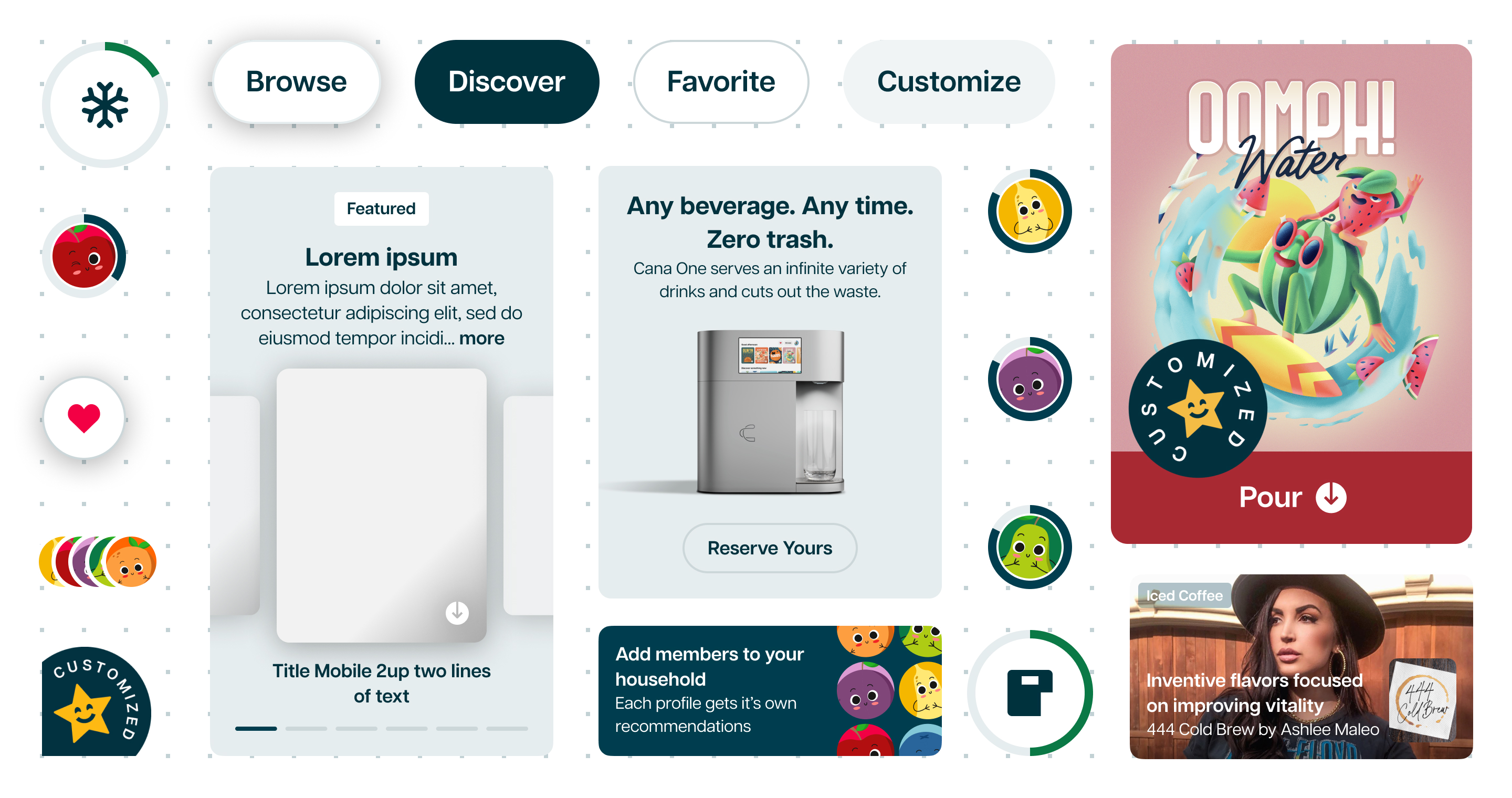
I updated Cana's color palette to be accessible, and designed interactive components that were consistent and on-brand across mobile, tablet, web, and on-device.
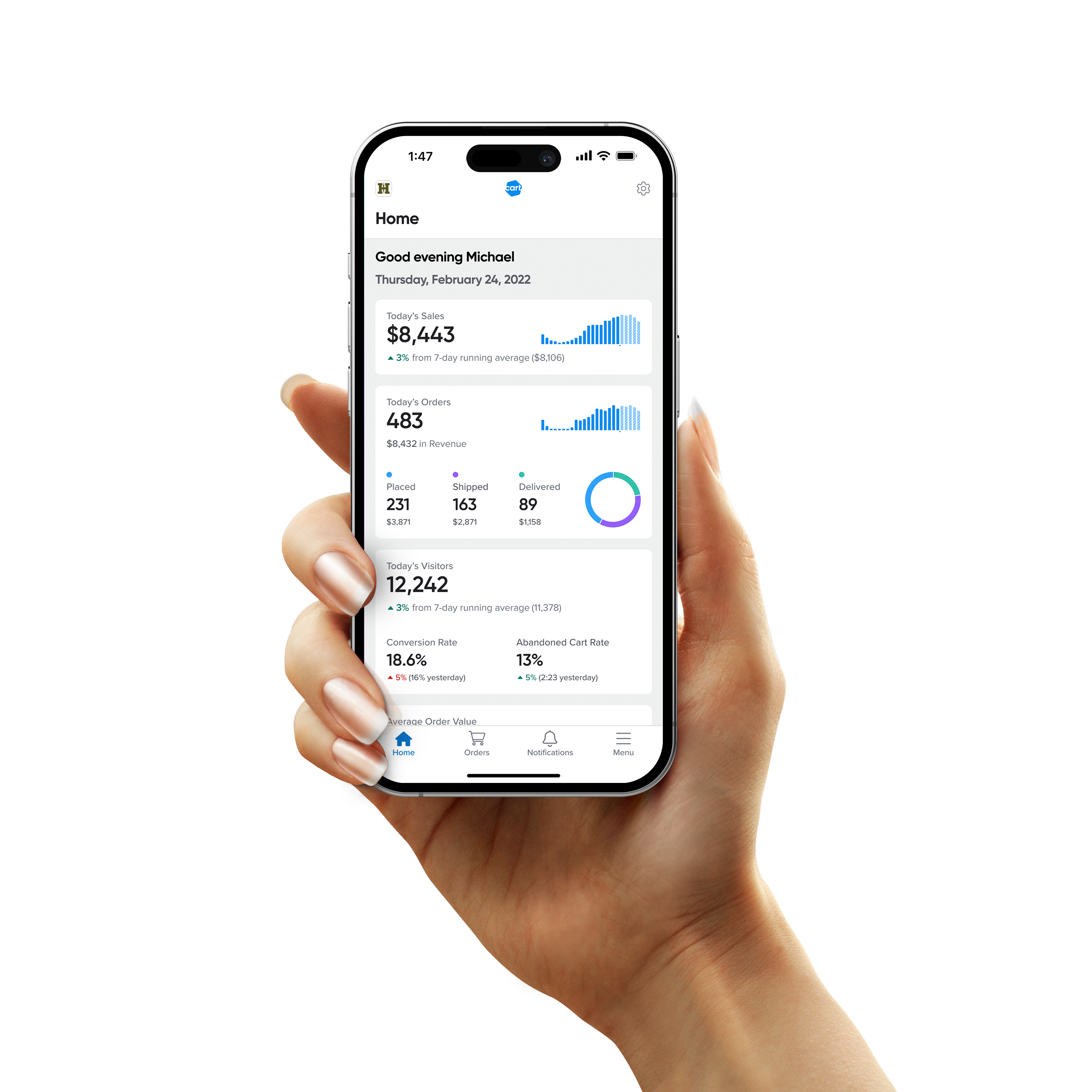
We merged multiple products into an easy to use experience for merchants to view current sales, triage orders, and manage inventory.
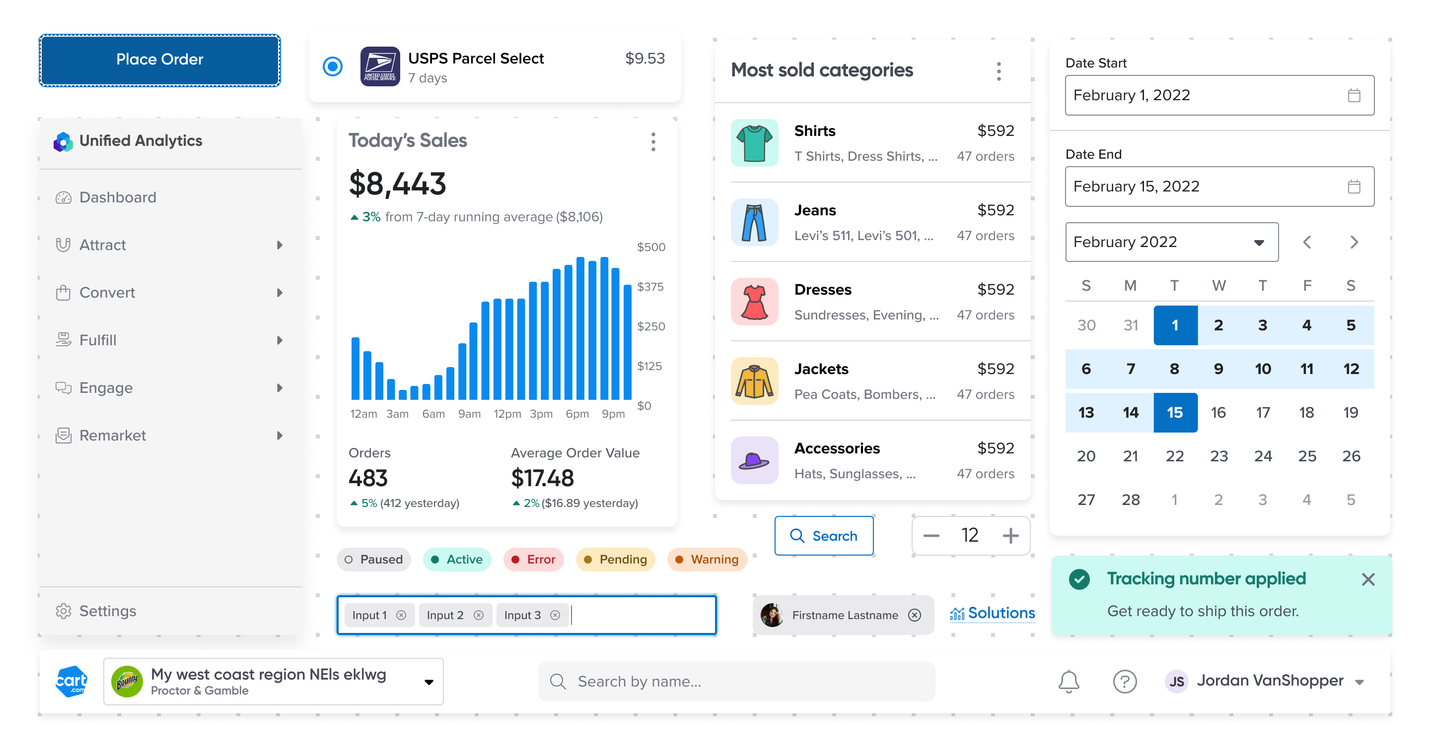
I updated the color palette, type system, and component patterns to make the components more accessible and usable for mobile as well as laptop and desktop sizes.
We redesigned developer's transactions, charge flows, and billing reports to improve transparency around developer's revenue, and make the subscription lifecycle more intuitive.
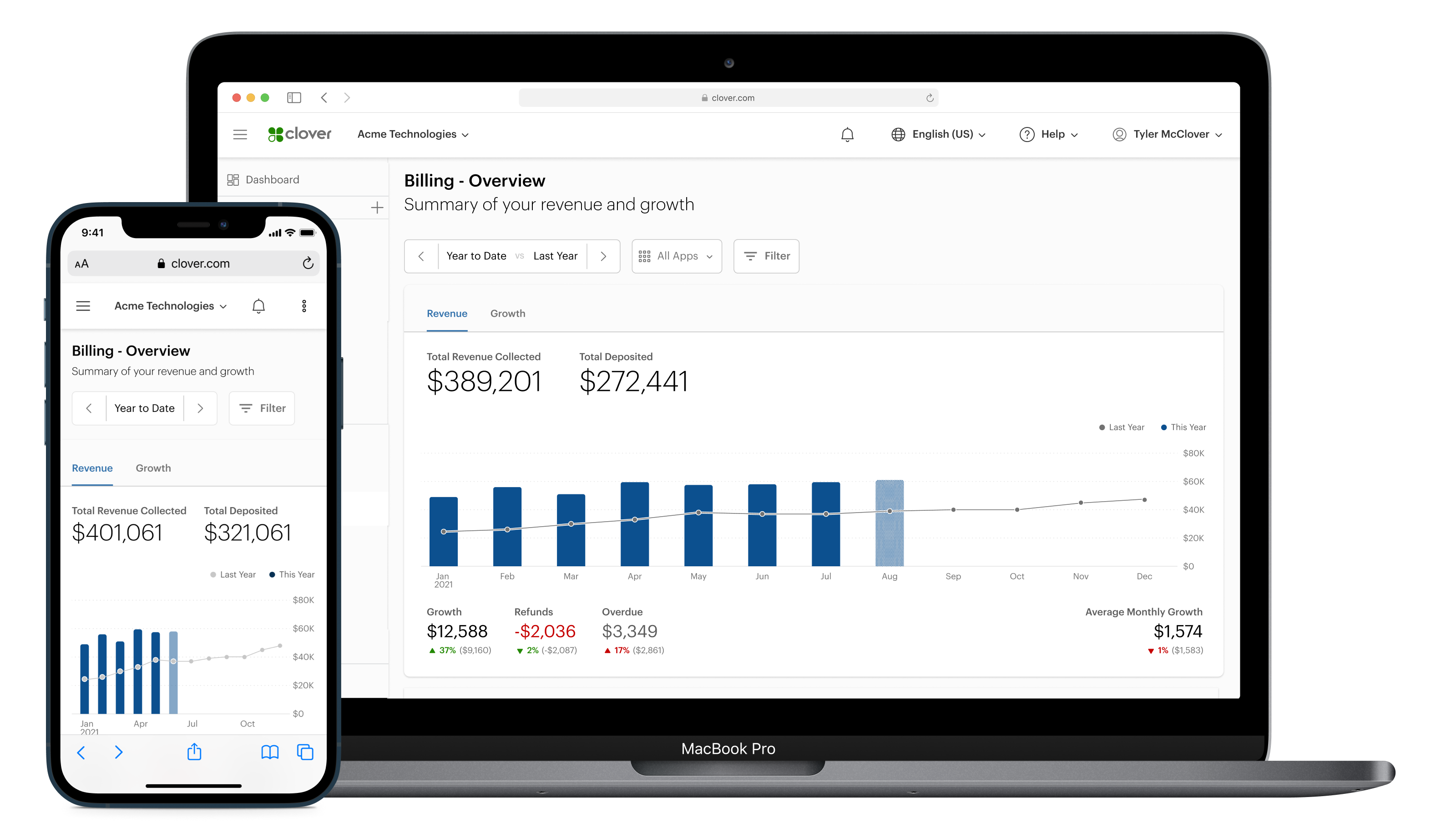
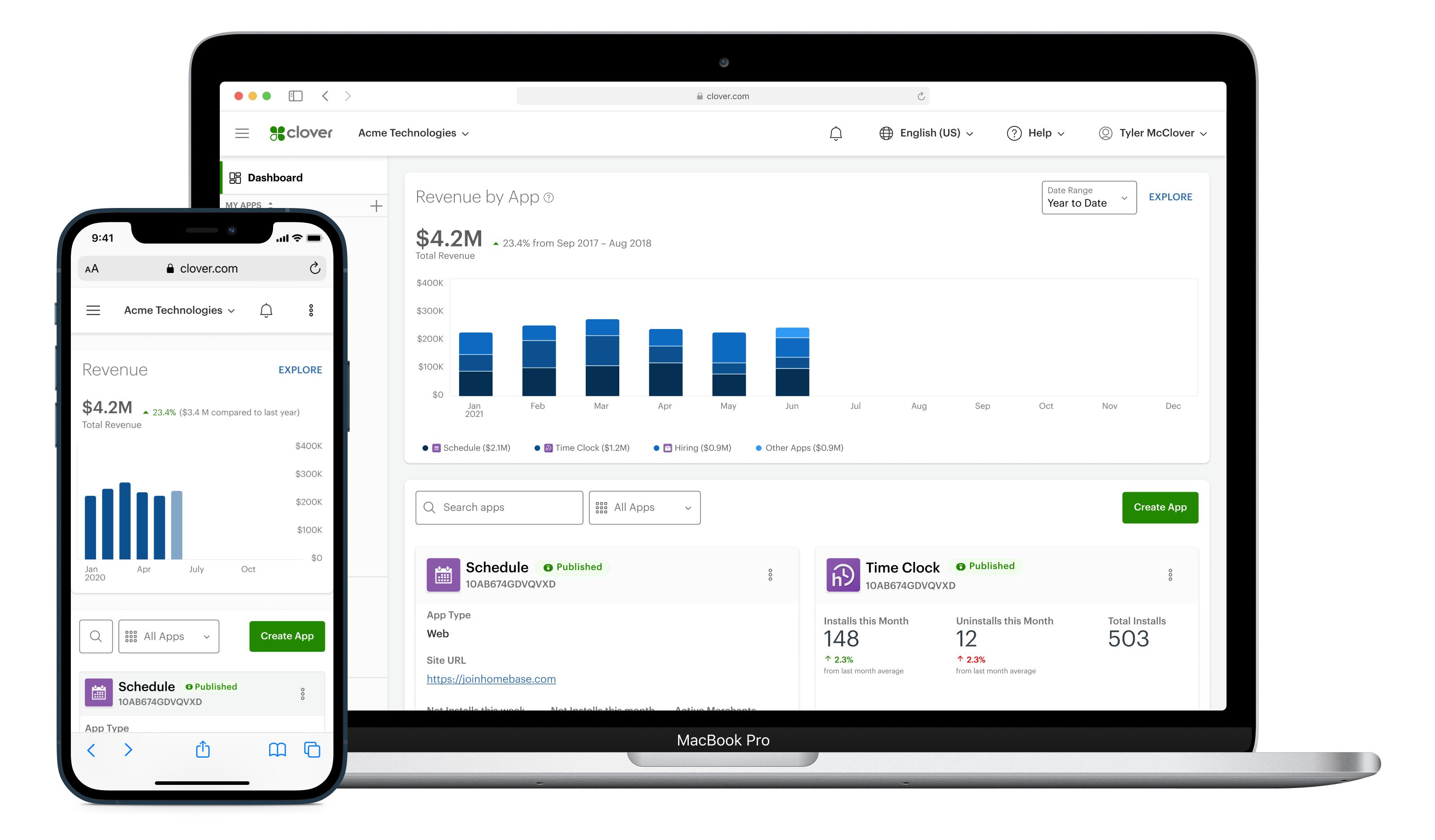
We designed a data visualization strategy across multiple pages in the Developer Dashboard, improving at-a-glance comprehension of installs, uninstalls, and revenue.
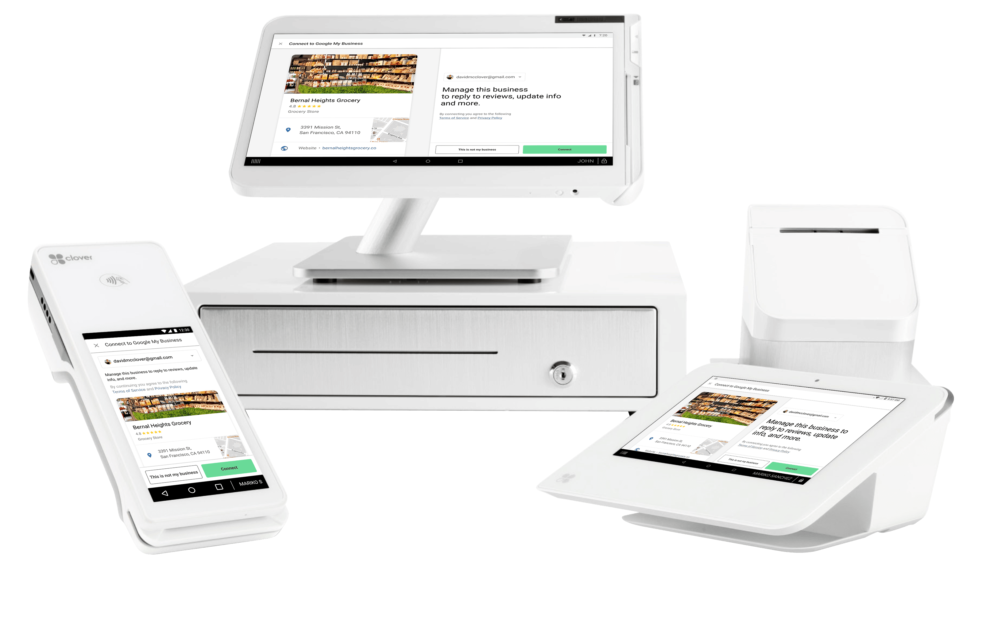
We designed an onboarding flow for Clover merchants to use the Google My Business app, ensuring a brand-aware hand-off between Clover merchants and Google My Business.
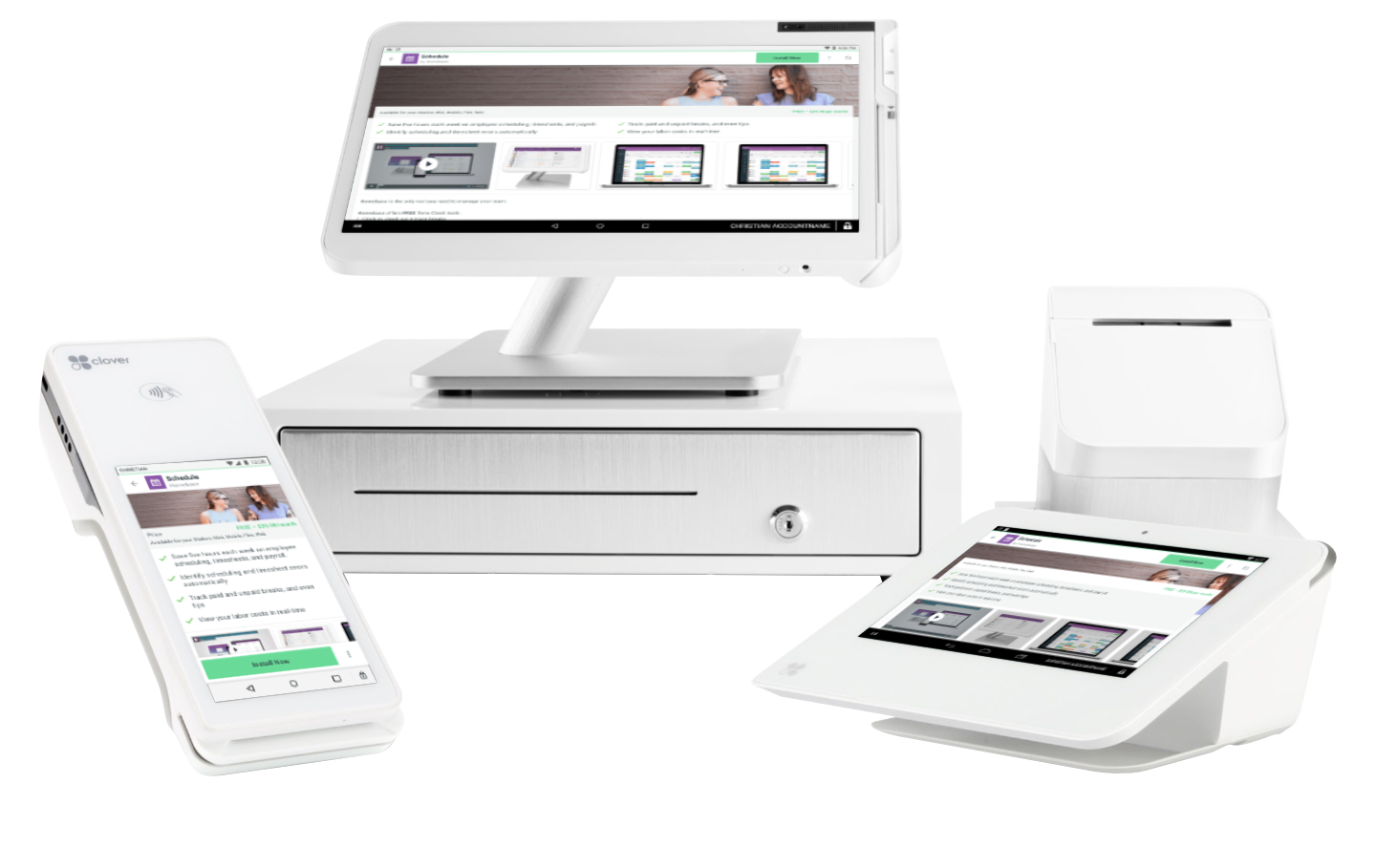
We redesigned the App Market to highlight each app's benefits for the merchant, make the media more relevant and engaging, and increase conversion.
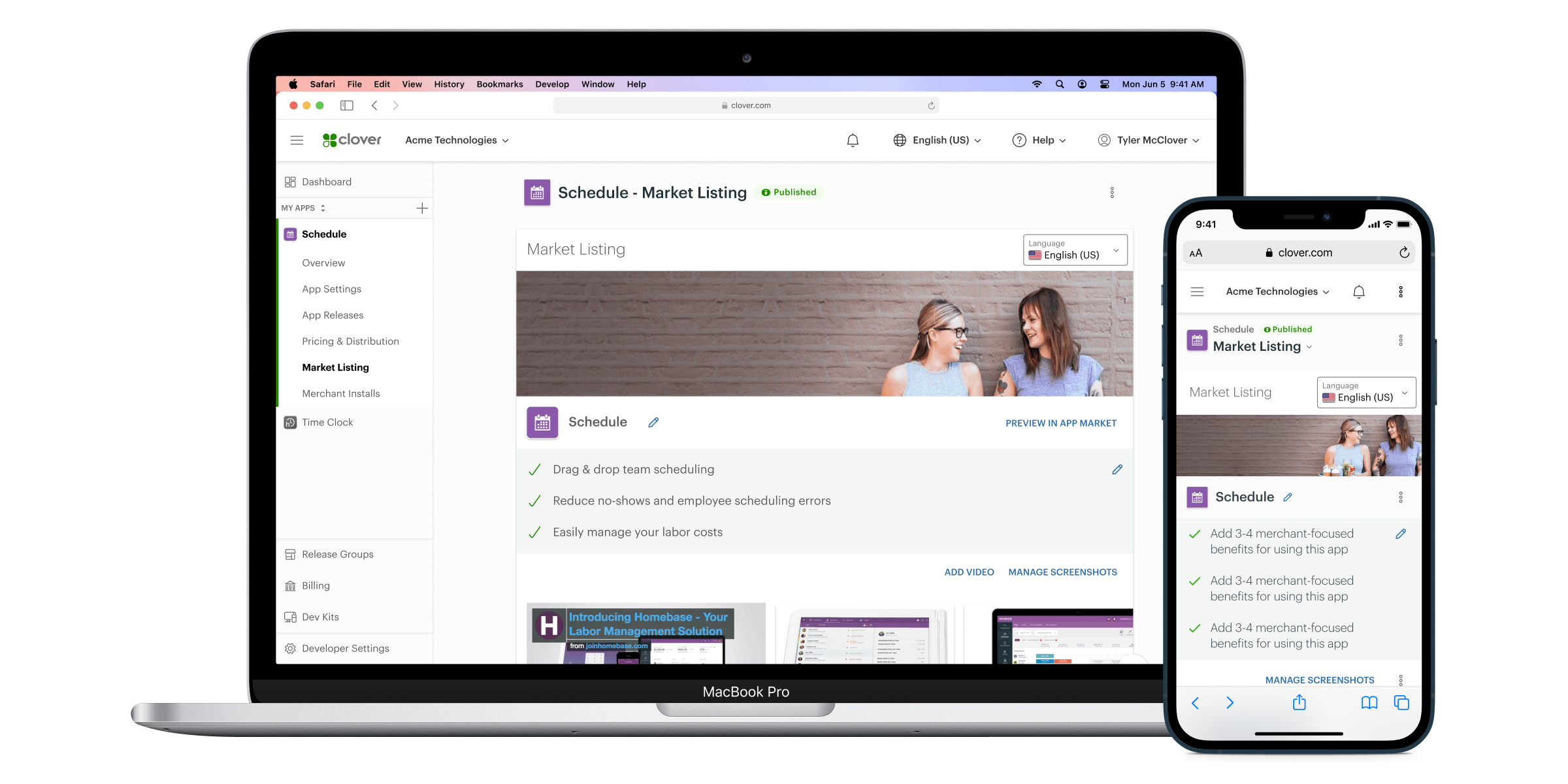
We redesigned the developer dashboard to improve the navigation and information architecture, improve usability across task flows, and update the visual design to a modern and responsive structure.
